Work Placement: Summit Digital
See below for work completed as part of my placement at Summit Digital (May 2021 - present).

Project Overview:
Following my participation in a previous university project with Summit Digital (Forghetti social media campaign), I was offered the opportunity to work for them on a freelance basis. This provided me with the chance to work on a variety of different projects for Summits clients.
January 2022 - May 2022
Due to me deciding to prioritise my university work this semester, I made the decision to temporarily reduce my workload at Summit. I was therefore given the role to focus solely on producing more content for the forghetti social media pages. I am happy with the work I have produced this semester and have recieved lots of positive feedback.
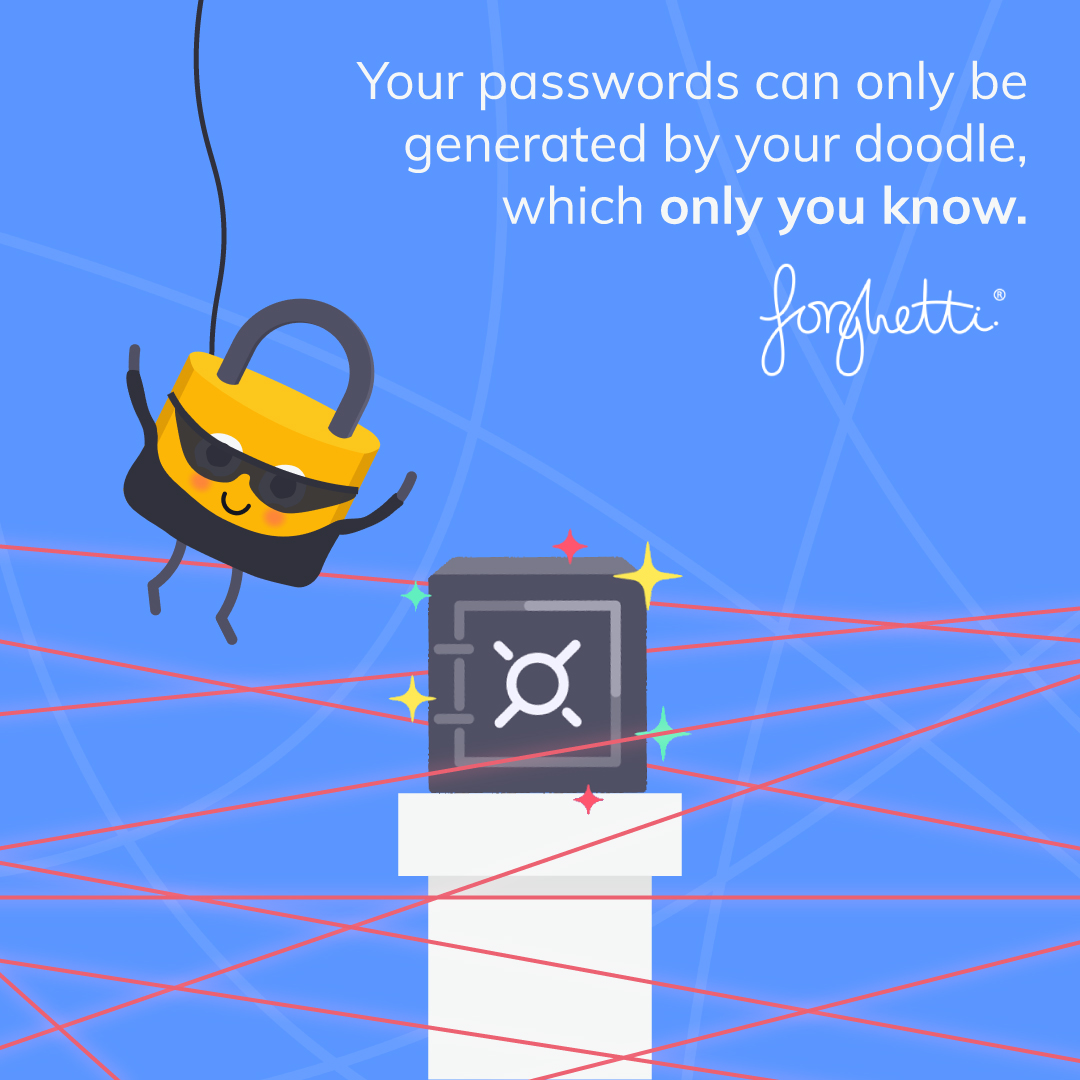
Forghetti:
As a continuation of my university project last year, I have been producing content for the forghetti social media pages (Instagram, Facebook and LinkedIn). I was mainly tasked with producing content along with specific events (such as christmas, halloween, new updates etc..), however also produced more generic illustrations, to be used in between. I had to ensure that the illustrations fit forghettis house style and incorporate the colour scheme from the branding guidelines. I found this fairly easy as I have been producing content for forghetti using this style for over a year now.


May 2021 - December 2021
Forghetti


I also was given the task of following a template to create a series of animations. These all followed the same format, however the colours and text varied. This was a very time consuming project, as there were 40 different variations which I was asked to produce.
Click Here to view the handover document for this project!.
Humphrey Feeds & Pullets:
The next client I worked for was Humphrey Feeds & Pullets, a chicken food company. I worked on three projects for them including an illustration, a poster and some animations for social media. As part of their 'Egg Size Matters' campaign, I produced an illustration, outlining the lifecycle of a chicken, and how this affects the number and size of eggs they lay. I had to ensure that my work remained consistent to the clients prefered style. I therefore incorporated their signature dark green colour as well as a photograph of some eggs, as photography plays a prominent part of their branding. I am happy with the outcome of this illustration. In particuklar I was praised fr the art style of the chickens and how they added comedic value to the campaign.


I was tasked with producing a poster to be displayed in a feed mill, to help educate delivery drivers and workers on how to identify high quality feed. This project was very time consuming as I had to edit the indivdual images of chicken food, to ensure they all looked consistent. The original images I was given had poor lighting and were taken from slightly different distances, therefore I had to find a way to resolve this. I ended up removing the background from all the images and using a plain white background. I also had to reposition the pen in the images, to ensure it was straight.
Original Image vs Edited Image:


To get to the final design, I went through several different design variations. My initial idea was to use a landscape canvas, however I later decided to change to a portrait view, following discussion with the client. I also later decided to incorpoate a magnified view of each of the different feeds, to help make the different appearances more visible. This project involved lots of commiunication with the client to ensure the outcome was to a high standard and met their requirements. I think that the final outcome looks sleek and proffessional, and fits their brand well.
Final Outcome:
I was given the task of animating some assets, which had been created by another designer at Summit. The animation was for a competition to win a bottle of gin, to celebrate 'British Egg Week'. I used the stroke effect on After Effects, to create the write-on text effect. I initially had a problem masking, which caused other elements of the project to disappear, however I later overcome this, using lots of trial and error. I also made the background spin, as I found this made the animation more eyecatching and reminded me of an old fashioned TV advert. I got lots of positive feedback for these animations.


Click Here to view the handover document for this project!.
Williams Shipping:(Willbox)
I completed some work for Williams Shipping, a marine and logistics company. In particular, I produced content for Willbox, their storage division. Firstly I produced an illustration of the Petersborough cathedral, to go on their website, to promote one of their locations. I had to try and replicate the style used on other illustrations on their website, which was very simple and geometric. I did however find it difficult deciding the level of detail which I wanted to go into as the cathedral itself has very intirquete details. I decided to keep it simple as to not overcomplicate it.

I also created a series of banner designs, to be used on the footer of emails. These were to promote specific conferences which Willbox would be at. I also created a couple of social media posts, following a similar style. I had access to lots of assets, including photos and logos, which made this task fairly simple. I like the outcomes as they look professional and fit the brand guidelines effectively. The main challenge for this project was to try and fit all the content into a small amount of space, without making the design seem cluttered. I think I have achieved this.


Click Here to view the handover document for this project!.
Woodpecker Self Storage:
As part of Summits website development project for Woodpecker Self Storage, I was tasked with producing some 3D models of the inside of different sized storage units. As I have no experience with 3D modelling, I was given access to Roomle, an online software, which allows you to create room designs, using drag and drop functions. I also used Photoshop to edit the walls of these designs, to create a corregated effect, to make the rooms look more like storage units. As Roomle doesnt allow you to export designs as an image file, I had to screenshot them, to upload to Photoshop. This created the issue of the designs being screenshot from slightly different angles. I therefore had to ensure that I was precise when doing this. The final designs have now been uploaded on Woodpeckers website, to promote the different sized store units, which they available for rent.


I also was given the task of designing a flyer to be printed and distributed in the local area, to promote the company I was given a brief to include features such as a map, contact information, available sizes, the key words (sustainable, secure, relaxing, accessible) and a QR linking to the companys website. Initially, I used a map which I screenshot from Google Maps, however I found that it looked a bit bulky therefore I decided to illustrate a map, which I found looked sleeker and more minimal. I think that the final outcome is effective as it is simple to understand whilst still being interesting to look at and utilises the branding. In particular, I like how I was able to incorporate the logo into the QR code.


Final Outcome:


Click Here to view the handover document for this project!.
SCMS:
This is a project which was started, however was scrapped shortly after, due to lack of funds from the client. The project was to reformat a series of forms, to make them more visually appealling and to make them interactive. I had never worked with interactive PDF's before, therefore this project taught me alot. Prior to this project, I didnt know that it was possible to add interactive elements using InDesign. I found this project very tedious and time consuming (one form took 7 hours!), however I am happy with the outcome. The original forms were very plain and confusing to interpret. I therefore have successfully been able to improve this for one of the forms:
Click Here to View in Different Tab.
Millgate:
I was given the task of creating an advert for an estate agent in Winchester. This was a very simple project to complete as I was given a template to use. The client wanted me to include a brief desciption of the property advertised, alongside the contact details of the estate agent. A handover document wasnt necessary for this project, as all I had to do was input informtation into a template.
LumaOne:
This was a website development project taken on by Summit, which I didnt have time to work on due to the demands of other projects, however I was able to contribute to the initial brainstorming stage. The majority of my time spent working on this was dedicated to gaining an understanding of how to use the software, which the website was advertising. I found it quite confusing to use at first however after watching a demonstration from the client, I found it slightly easier. This initial idea was for me to produce a series of animations which highlighted the functions of the software. My lack of understanding of the software, as well as disagreements with the client meant that I later decided to dedicate my time to other projects instead. I was however able to produce a couple of animations, as requested. I like the outcome of them as they are smooth and professional looking.


Click Here to view the handover document for this project!.
Spark For Growth:
This is an animated logo project which I completed over the summer. This was just a small task I was given and I am unsure which client it was for and have struggled to track this down unfortuantely! due to my lack of organisation at the early stages of my placement, I also do not have a handover document to show. This however was a fun little project to complete and involved lots of communication with Summit, to ensure the animation was refined to exactly how the client wanted it. In the end, I produced over 20 different versions of this animation, all with the spots appearing at different speeds and in different formations. Most of them are very similar, however I have selected a few of them to upload here onto my portfolio (starting with an earlier version and leading to the later versions). I am also unsure which logo was actually used, as I did not have first hand communication with this client:


Keysafe:
My contribution to this project involved producing an animation to go on the homepage of a website which Summit has been developing for Keysafe, a company which helps landlords gather information from future tenants before they sign the contract. I was given the task of producing an animation which highlights the process of this and how speedy it is! I animated this in a checklist style, which ends in an icon stating the completion of the process. I started by creating a storyboard to pitch to the client to ensure they liked my idea before continuing with the animation.

Following the clients approval, I began the animation process. I had to animate each element individually, which was quite challenging at first, however became easier the more I worked on it. I updated Summit on what I was doing throughout the animation process, to gain any feedback from them. They suggested that I sped up the animation, which I agreed was a beneficial choice. Here is the final outcome:

Click Here to view the handover document for this project!.
Marstons Telecoms: (Waypoint)
Recently I was put in touch with Waypoint, another digital marketing agency who often work closely with Summit. Waypoint gave me a project for one of their clients (Marstons Telecoms), involving producing animations for their social media. The animations were based on the ideas pitched to me by Waypoint. They reached out to me as they had been told about my animation capabilities and wanted to utitilise this since they do not currently work with an animator. I maintained close contact with Waypoint throughout this project, through zoom meetings and emails. I worked on two main styles of animation: text based case studies, and coloured illustrative animations. I really like the outcome of the animation created. I think they look professional and eye catching.
Case Study: Spotted Dog Pub
To produce this animation, I was given some quotes and a background image, which I was asked to incorporate in the animation, with other aspects of the branding such as the tagline, logo and line connectors (graphics). The original background image was of two chefs. I had to edit this image as it was landscape therefore wouldnt fit the square frame, without cropping off the chefs. I matched the background colour and attempted to extend it upwards, so that it would fit the square. I think that this has worked quite well.


I used Illustrator to create the line connectors. I made the quotes fade in and out to tell the story from the case study. Following feedback from Waypoint, I slowed down the quotes, so that they could be read for longer. I like the final outcome of this. I think that it helps to portray the case study well.
Case Study: Dudsbury Golf Club
I was asked to follow the same style as the previous animation to create another in relation to another case study. I was also asked to animate the connectors so that they appear and disappear. I was able to achieve this using the stroke effect in After Effects. I had difficulties positioning the text in this animation, as the background image is quite busy, therefore makes it harder to read. I reached out to Waypoint for their opinion, and was recommended to place the text at the bottom of the frame. This allows both the text and background image to be seen clearly.
PSTN Switch-Off:
I was asked to produce this animation in an illustrative style. I found that using white assets on a coloured background was eyecatching. I like the outcome of this. I think that it is simple, but effective and have been complimented by the client for this. I was also asked to produce a static image, which related to the animation.

Is Wifi better in sports clubs or on public transport?:
For this animation, I was asked to present some survey findings, using a similar style to the previous animation. I created the assets in Illustrator then imported them to After Effects, where I animated them to move and added the text. A technical error which I faced during this project was that the colours which were in the branding guidelines did not seem to match the colours I was using, despite using the exact hex codes. I initially thought it could be due to me potentially using a different colour setting to Waypoint, however after contacting them I learnt we were both using the same (RGB).
Eventually I was advised to use the colour selector tool, to attempt to match the colours. Further discussion with Waypoint encouraged more changes. I like the final outcome of this. I think it is a fun way of revealing the survey findings.
Tech Check:
I was also given the task of improving an animation which had already been made. The original was glitchy and low quality. With further investigation, I realised that it had been animated frame by frame, using InDesign, which has resulted in the glitchiness. I therefore remade the animation from scratch, using After Effects. I think that the final outcome looks alot smoother.

Click Here to view the handover document for this project!.
Reflecting on my work placement so far:
I have found my time at Summit so far enjoyable. I have learnt alot about how to design in a more professional way. This includes how to follow branding and briefs specifically as well as admin procedures, such as organising and naming files. I have been given a company email, which has allowed me to communicate directly with clients, speeding up my workflow and helping to ensure that the content I am producing matches their preferences. When I first started I was quite unsure of what I was doing and was constantly asking for help however as I have gained more experience, I have found myself become more independent. I also initially found following a client breif difficult, especially in instances where my opinion on how something looks has differed from that of the clients. Over time however I have had to learn to give the client exactly what they want, as they are the ones paying for it. I have however found confidence in making suggestions for different design choices. My placement has allowed me to improve my software skills. For example, prior to the SCMS project, I was not aware that interactive pdf's could be created on InDesign, however I am now more confident doing this. Animation projects have also helped me to learn how to mask on After Effects. I like how I have been able to work on a variety of projects, each utilising different skills and software. I have found it difficult managing my time this semester, where I have had to balance university projects, with my work placement, and another part time job. Next semester, I am aiming to be more organised and find ways to allocate time more effectively to ensure I am able to get everything done. I currently do not have any set times/days which I work with Summit. Instead, I just work whenever I have some time/ they have work for me. Next semester I could therefore dedicate a set amount of time to ensure I have enough time to work on my university projects aswell.
Click Here to view NLT1 form (I have not changed this as I have stuck with what I planned).
Click Here to view the work placement agreement.
Additional Project: Banshee Logo Design
(This is a client project which I completed alongside my placement at Summit, however is not affilifated with Summit).
During semester 1, I was put in touch with a client who wanted a logo designed for a new guitar company. The brief was to design a simple, but edgy logo, which can be printed onto the headstock of their guitars. They wanted the logo to fit the name 'Banshee', referring to a screaming witch. I remained in consistent contact with the client throughout this project, to ensure that the logo me their requirements.
Initial sketches:

Digital Mockups:


I liked the use of a more traditional serif font, with the slight warp to make it more edgy. I also like the addtion of lines to replicate guitar strings. Despite gaining positive feedback from the client, they decided they wanted to take it down a different route and presented me with some drawings for me to mockup.


The client wanted the logo to feature a stylised 'B' that looked like a guitar. I made the changes to the design and was provided with more feedback from the client to make it seem more geometric. They provided me with some drawings which I then used to mockup more designs. Further refinement was required, to lead to the final outcome being completed.
Final Design:
