Final Major Project: Canopy Coffee Co.
Brief: To design the branding for a sustainable coffee business.

Project Overview:
As part of my DM3103 Negotiated Design Final Project module, I was given the freedom to choose my own project to work on. After brainstorming ideas, I decided that I wanted to work on a branding project. This is because most of my recent projects are UI/UX or social media based and I have not done much branding before. I therefore thought that this would be a good opportunity to expand my skillset and become a more versatile designer. Other potential ideas included illustration for a book or a promotional campaign for an event. I decided to design a sustainable coffee brand because I found that current products on the market were quite plain and it gave me the opportunity to produce something really interesting, particularly in regards to the packaging. The general concept for the brand is a sustainable shade grown coffee company, which sells coffee related products, originating from different cultures. The final outcome for this project includes a full brand guidelines document, as well as product renders. The software used for this project includes Adobe Illustrator, Photoshop, InDesign, After Effects, XD and Dimension.
Final Outcome: Canopy Coffee Co. Brand Guidelines
Development of ideas:
The initial inspiration for this project came from existing branding projects, which I found on Behance. I also used google images to find existing projects and create a mood board, to reflect the type of brand which I wanted to produce. I wanted to create a really fun and colourful brand, which would stand out on the supermarket shelves, as existing sustainable coffee tends to come in very simple or brown packaging.

Background Research:
In order to design a sustainable coffee brand, I had to gain an understanding of how envrinmentally friendly coffee farming is and whether there are any methods which are more sustainable. Online sources helped me to identify two different types of coffee farming: sun grown and shade grown. Traditionally, coffee was cultivated in the shade under the canopies of the trees, however due to increased market demand, farmers began to grow coffee in the sun instead. Sun grown coffee is able to produce a higher yield however has a negative impact on the environment. For example, deforestation is required to clear the land for these farms. The lack of vegetation leads to a lack of biodiversity and increases the rate of soil erosion. Extensive chemical pesticdes and fertilisers are also required, which causes further environmental damage, for example by contaminating nearby water sources. In contrast, shade grown coffee is a more sustainable method. By planting coffee under the canopies of mature trees, there is less need for chemicals to be used, where the surrounding vegetation is able to provide the coffee with nutrients. Furthermore, the trees protect the ground from being burnt by the sun and prevents soil erosion. Growing coffee in this environment also supports biodiversity where the trees provide an ideal habitat for species, particularly birds.
I produced an infographic to help explain the difference between sun grown and shade grown coffee. As well as to set a context for the brand, producing this infographic helped me to improve my own understanding on the topic. I wanted to keep the design simple, to help portray an obvious difference between the two techniques. I later reformatted the infographic, to fit the dimensions of the branding document.

I also conducted some research on who the potential audience for Canopy Coffee would be. I wanted to find out the different types of people who purchase sustainable products. I used the sustainability adoption curve model (seen below) to identify the four types of people who consume sustainable products: inactives, passives, followers and frontrunners. Each group is increasingly more proactive when it comes to sustainable consumption. This model helped me to consider how the brand needs to appeal to people with different views on sustainability.

(Source:https://www.kerry.com/insights/kerrydigest/2021/sustainability-persona)
From my research, I was able to create three different customer persona, which can be seen in the below infographic. Canopy Coffee is intended to be sold in supermarkets and online. Whilst supermarkets may attract a more mainstream buyer, those who are more sustainability conscious may be more likely to go out of their way to source the product online. I wanted the brand to appeal to a wide demographic, to communicate the positive ideas of sustainability and cultural diversity. More specifically, Canopy Coffee Co appeals to those who are more socially and ethically aware as well as young adults wanting to make a change.

Background research sources:
www.sustainablebusinesstoolkit.com/environmental-impact-coffee-trade/birdandwild.co.uk/pages/sun-grown-vs-shade-grown-spot-the-difference
kerry.com/insights/kerrydigest/2021/sustainability-persona
latana.com/post/audience-sustainable-brands/
Design Process:
The first aspect of the brand which I created was the name. I wanted the name to represent the context of shade grown coffee and sustainability. I brainstormed lots of ideas before deciding on Canopy Coffee Co. The name relates to the idea of shade grown coffee being cultivated in forests under the canopy of trees. Another initial concept for the brand was that with every purchase, a product will be donated to food banks. Some of the name ideas therefore represented this. Potential name ideas included:

Logo Design:
The logo was the next priority. Initial ideas involved coffee cups and coffee beans in a more illustrative style. This later evolved to include a leaf instead of a cup, to further relate to the brand name and context. I used illustrations of jungle leaves for inspiration.
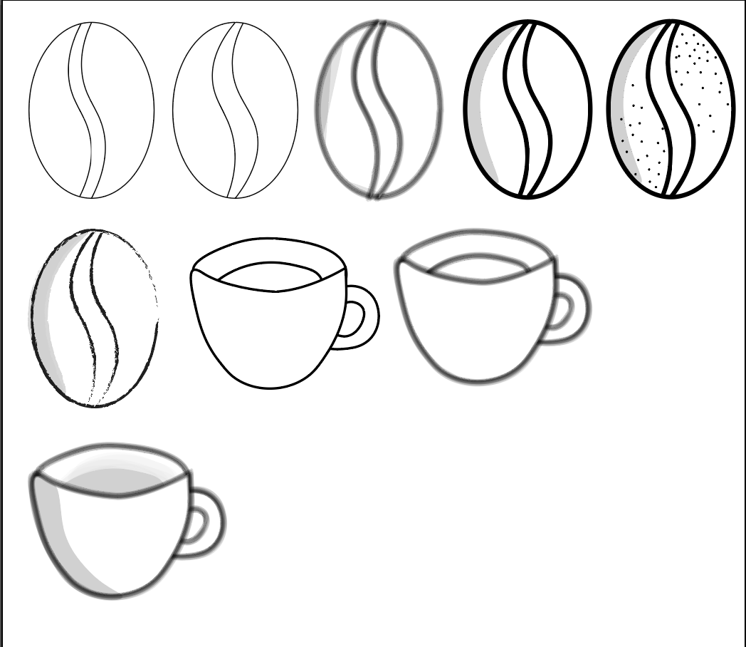

The progression of the logo development, including some initial sketches can be seen below. I experimented with different versions of the leaf and bean as well as the stroke/fill types and the way which they overlap. In the end, I decided that the solid filled leaf being overlapped by the bean outline looked the most effective. I also removed a section from the leaf where the coffee bean sits, to make the appearance less cluttered.:


I then experimented with different typefaces, to be included in the logo as well as the brand as a whole. As well as the name, I also wanted the slogan 'sustainable shade grown coffee' to appear on the logo, in order to help further demonstrate the concept of the brand. I decided to use two sans serif fonts, bebas neue and futura, as they complimented eachother well, whilst remaining simple, to allow the type to be easily read and with the intention to not divert attention from other aspects of the brand. I decided to use bebas neue for headings (including the brand name on the logo) and futura for body text (as well as the strapline on the logo).

I then experimented with different ways which text could be positioned on the logo. I decided that the text looked best below the logo, therefore progressed with this idea:

The final outcome includes three different logo variations: a primary logo, a secondary logo and a submark. I am happy with how these logos turned out. I think they look professional and effectively communicate the brand message:
Primary Logo:

Secondary Logo:

Submark (Icon) Logo:

Colour Scheme:
I used an online colour palette generator to experiment with different colour combinations. I wanted to use colours that were bright, yet slightly muted still. From the beginning of the project I knew that I wanted the packaging to be a focal point which makes the brand stand out against others, therefore it is essential that the choice of colours can achieve this. I chose to use multiple shades of green to further represent sustainability the idea of shade grown coffee, whilst the pink, orange and yellow are very warm shades which symbolise positivity. I later decided to incorporate a darker green shade and white into the colour scheme, to allow a greater contrast between shades.


Packaging Design:
As previously mentioned, I always wanted the packaging to be a focal aspect of the brand, to differentiate it from others on a shop shelf. I decided to design four different products, each reflecting the culture of a different country where the coffee has originated from. These countries were: Mexico, Brazil, India and Ethiopia. I researched other potential origins however I decided to focus on four, to allow myself time to complete each design to a higher standard. If more time was available, perhaps I would have extended the product range to include coffee from additional countries. When designing the packaging, I researched the culture for each country, to identify elements which could be included in an illustrated pattern.

I had to consider what I wanted the actual container to look like, rather than just a label design. After researching different types of sustainable packaging I decided to use cardboard, as it is cheap and recyclable. I also brainstormed different shapes for the packaging and ended up choosing a cylinder.


Mexico:
I identified aspects of mexican culture, which I wanted to reflect through my illustrative choices. These included: different types of flowers, cactus and the day of the dead festival. I also wanted to integrate a famous landmark into each design, therefore decided to illustrate Chichen Itza.


Brazil:
I identified aspects of Brazilian culture, which I wanted to reflect through my illustrative choices. These included: Carnival, tropical birds, and exotic plants. I took particular inspiration from the Amazon rainforest. The landmark which I included in the design was the Christ the Redeemer statue.


India:
I identified aspects of Indian culture, which I wanted to reflect through my illustrative choices. I tried to replicate indian patterns in my own style. This included mandela, flowers and elephants. The landmark which I included in the design was the Taj Mahal.


Ethipoia:
I identified aspects of Ethiopian culture, which I wanted to reflect through my illustrative content. These included: tribal inspired patterns commonly used in Ethipoian artwork and the Ethiopian wolf. The landmark which I included in the design was the Nile Waterfall.


After designing the individual assets, I combined them together to get a general idea of what the pattern would look like, before constructing the final design.


I experimented with different layouts for the packaging design. This task was quite difficult as the patterns created were very loud, therefore I had to ensure that the text could still be read easily and that the overall design didnt look to busy. I found that the best way to achieve this was to make a lower opacity outline of the pattern take up the majority of the space, while a strip around the centre features the full coloured pattern. By using the dark green shade for the background, it allowed the colours to really stand out.


Final Packaging Designs:
I am pleased with the final outcome for the label designs. I think that they stand out and reflect the culture of each country well. An issue which I had to overcome was each design looking too similar, when viewing from a distance. This is a result of the same colours and style being used for each design. I did this purposely however to create consistency. I was able to overcome this issue by using a different lid and border colour for each design.


Product Renders:
Once I had finalised the packaging designs, I was able to mock them up in 3D, using Adobe Dimension. I have not had much experience with this software before, however I found it quite easy to get the hang of. The way which I produced the mockups was by using the premade 'Tube Packaging' shape and altering the dimensions so that it was the correct scale. I then added the label designs as a material and added a cardboard texture. An issue which I had to overcome was the renders being blurry. I was able to resolve this after speaking to CAD students, who have to render regularly. Once I had increased the canvas size, the render quality improved drastically. I think the final renders look really professional. The use of lighting effects make them look quite realistic. I imported a background which I had designed, which I think was really effective. Once I had rendered the images, I was able to edit them in Photoshop.


Hero Image:
I produced a hero image to be used on the cover of the branding guidelines document. I used Photoshop to create a reflection effect, as I have seen this done before on adverts for real products and I think it looks effective. I did this by flipping the background below the product and adding a blur. I then placed the logo onto the image. I really like the outcome of this. I think that it looks professional and encapsulates the brand well.

Image Manipulations:
Using Photoshop, I was able to manipulate the rendered images, to place them in different scenes. I wanted to place the product in a forest scene, to represent the way which the coffee is grown. I achieved this using a stock image. I edited the coffee image to match the shadows with the forest background. To add more depth, I cut out areas of the forest and moved them onto a separate layer, which I moved in front of the coffee. I really like the effect this has created. I think that this looks professional. If more time was available, I could have created more of these edits, to use as promotional content. To make this look more realistic, I blurred the edge of the coffee container, so that it wasnt as obvious that it had been cut out and placed in the scene.

Up until this point in the project, I had not included any images of actual coffee. Since this project is to brand a coffee company, it was important to try and incorporate images of the product, outside of the packaging, to create a sense of reality. I downlaoded a stock image of coffee beans and positioned the coffee container over the top. I reduced the opacity so that I could see the layer below. I then cut out a space for the product to be revealed. I increased the opacity and rearranged the layers to produce the final outcome. I also added a drop shadow to make the image seem more realistic. I really like the outcome of this. I think that it looks professional. Despite this, if I had more time to improve this, I would alter the lighting, to increase the sense of realism.

I designed a poster, to help promote the brand. I combined one of the renders with a coffee mug and the strapline 'choose your origin' to promote the different coffee origins within the product range. The logo is located at the bottom to further reinforce the brand identity. I also downloaded a Photoshop template, which allowed me to manipulate the poster into a public setting. I like the outcome of this and think that it is eyecatching. I used the rule of thirds technique when positioning the assets, to increase the visual appeal.


Furthermore, I wanted to see how the packaging design could be altered for other products. I therefore decided to manipulate it onto coffee pods. I like how the overall design turned out however I think that improvements could be made to the lighting effects.

Website:
Using Adobe XD, I created a mockup of what the Canopy Coffee website would look like. I went for a simple design by using lots of white space, but adding colourful product imagery to increase the visual appeal. I took inspiration from an existing coffee companys website (https://chamberlaincoffee.co.uk) as I found that the simplistic style they used helps to divert further attention to the products on sale. I produced the web mockup for two different screen sizes, to replicate responsiveness. I have currently only created mock ups for the homepage and shop page, however if I had more time, I would have produced a full mockup of the entire site.


Social Media:
Social media is an important asset to every modern business, therefore it was essential to integrate into this project. I created a number of different designs to be posted on Instagram. These posts were a variety of product renders and factual content. I decided to include the facts as it helped to reinforce the informative voice of the brand, by educating its audience on environmental issues. I like the outcome of these social posts however if more time was available, I would resize them so that they were more appropriate for other social media platforms.


Animations:
I created some animations to make the branding document more interactive, to increase the visual appeal of it. Using After Effects, I was able to produce an animated logo. I brainstormed some different ideas before I began animating. The concept which I had in my mind was for some kind of illustration to move around, before fading into the logo.


The idea I decided to work with was to animate a coffee cup, which would rotate as different colours exploded from it. This is to represent the different cultures exploding from the cup. I had not animated anything in a while, therefore this was a time consuming task, as I had to familiarise myself with the software again. I had to use trial and error to give a 2D illustration of a coffee cup a 3D rotation effect. I achieved this by incorporating a shadow which moved, to create the illusion that the cup was actually spinning. I then used the stroke effect and different masks to animate the droplets and lines exploding from the cup. I am very happy with the outcome of this. think that using motion graphics is an effective way to make the logo more interesting. Reflecting back on this however, it could be improved by having the logo fade in slower, as it looks quite rushed.
I also used Photoshop to produce two simple frame animations. One animation flips between the different packaging designs, whilst the other flashes the logo in different colours. This type of animation is simple to produce however the outcome is always effective.

Project Reflecton:
Overall, I am happy with the outcome of this project. I have produced a lot of content, which I believe to be high quality and have demonstrated a wide skillset. In particular, I am proud of the final packaging design and renders as this is what took the longest. I found it difficult to decide on the layout, however the final outcome looks professional and I believe it would stand out on a supermarket shelf. I have previously struggled with indesign and laying out documents in particular, however I have found that this project has helped me to improve in this area and become more confident using this software. This will benefit me in my future career path as a graphic designer. Furthermore, I havent got much experience copy writing therefore this project gave me the opportunity to have a go at it. I found writing the copy on the branding document particularly difficult. This is because Canopy Coffee Co is a brand which does not exist therefore I had to make up all of the information. I especially struggled when having to write about the companys tone of voice, which suggests that this is an area which I need to reseasrch further. Overall, I think that I have presented the document in a way which is visually appealling and makes you want to keep reading. In particular, the colourful product renders and animations contribute towards this. I have enjoyed working on this project and would consider continuing it in the future, to develop my skills and build up my design portfolio.
I have had to consider the United Nations sustainable development goal number 10 throughout this project. This goal refers to reducing inequalities within and amongst countries. This project has provided a solution to this goal by creating a brand which celebrates different cultures and sources its products using fair trade. Coffee farmers will be paid a fair price for their product, which will benefit them financially. Furthermore, by promoting shade grown coffee farming, an increase in demand from the success of the brand will create employment in this industry, and therefore promote upwards social mobility. This project therefore brings cultures together whilst aiming to reduce economic inequalities.
More about the sustainabiliy goals can be found here